 7.26 |  7.27 |
 Tutorial 7.25 In the tutorial 7.25, I learned how to reset default brushes, use the sharpen tool to sharpen an image, use the burn tool, use the smudge tool, and use the spot healing brush tool. I also used older tools like the eyedropper tool and the text tool to add things to the image. I really liked using the smudge tool because it makes the image look blurred in the areas that you passed the smudge tool on.
We had a presentation at my high school to warn against the dangers of driving under the influence. I found it very meaningful because we saw how easily an accident could happen and then we saw how the firefighters, ambulances, and police arrived at the scene to try to help. A couple of the students in my school volunteered to act as the people in these vehicles that were involved in a simulated accident. We witnessed how the "drunk driver" was arrested and how a couple of the other students in the other vehicle "died." After we had this simulated accident, every 15 minutes a student volunteer was pulled out of class because they had been in a DUI accident and had "died." Those students pulled out of class had their faces painted white and could not talk to other people because they were "dead." The next day of this presentation was also very eye opening because we witnessed how the family members of those that "died" in these accidents suffered. One parent presented a eulogy for his daughter who had "died" in this accident and though it was not real you could tell how much he really loved his daughter that just thinking about losing her made him feel like his heart was breaking. A student that had "died" also made a speech, or a last letter to her parents and it was also very heart-wrenching. I think a lot of people cried from hearing these speeches, and even though they weren't real cases of DUI victims everyone realized what a problem DUI is.
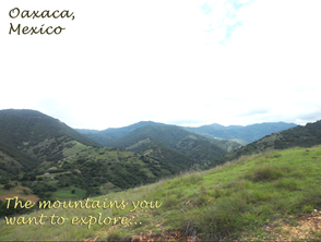
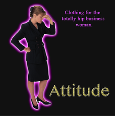
 7.18-70.23 In this tutorial I had to locate a photograph of a place and advertise it. I found a photograph of my home town in Mexico that I took a couple years ago and added some text to it. For the tutorial, I had to edit the font of writing that I chose to add. I beveled and embossed it like the tutorial told me to do. The tutorial was to test what I have learned in chapter 6 of the Adobe Photoshop textbook. In Chapter 7 I'm learning about different types of paint brushes as well as how to use the dodge tool,spot healing brush, and the patch tool. In the tutorial 7.13-7.23
In this tutorial I had to learn how to edit the font in different ways. I had to learn to bevel and emboss a font. I also had to learn how to blur the font so that it is not that clear. It is important to know how to edit the type font because in graphic design you will sometimes have to include type in your work.
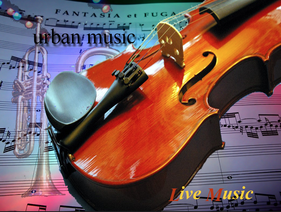
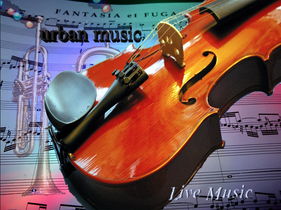
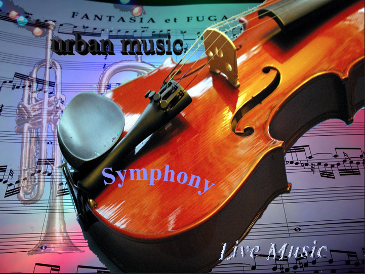
In this tutorial, I reviewed how to change font styles and color of the font on Photoshop. I learned how to change the kerning between two character list. I also learned how to create new Character Styles tabs and how to add a layer style button. Opacity controls the opacity of the shadow and at 0% no shadow is visible. I am currently in 6-27 but I don't know what it means by dragging the preview window of the dialog box. I don't really know what to do but since 3/4 I have made the letters of "urban music" 3D and the "Live Music" diffuse.
I have recently finished Ch. 5 tutorials and I am going to start Ch. 6. In this chapter we learned about using gradients, sampling colors, using sharpen filters, changing color modes, and using the paint bucket. We also had to structure the images in any way that we wanted, that would attract the most attention.
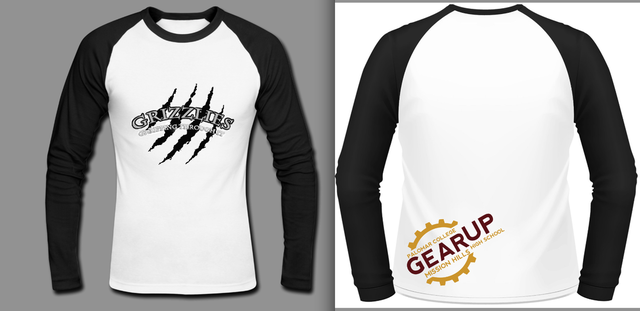 I put my design on an actual t-shirt so that we could see how it looks like. I didn't change much from our original design, except that we didn't include the grizzly bear with the word WASC written on it, instead I replaced that with the logo for Gear Up. I wanted the Gear up logo to look like a stamp on the back of the t-shirt and so I put it slanted on the bottom corner of the t-shirt. The design, I feel would have been better if I had put both sides in color instead of just one side. It could also be greatly improved by maybe adding the school name on the front or the back.
The image of the Grizzly bear is for the front of the t-shirt and the claw marks is for the back of the t-shirt. I worked on this t-shirt with Adriana Toledo and Michelle Espinoza.
1. What I like most about my t-shirt is that the we came up with the idea and then made it come alive on photoshop. 2. What I would have done differently if I had more time is that I would have made the image on a t-shirt template so that we can see how it would look like on an actual t-shirt. 3. What I learned about quick deadlines is that you have to work quickly, effectively, and still make it into good design. 4. What I like about working with Photoshop is that we are able to select certain aspects of an image to insert into our design without putting the entire image. I liked that I was able to put to use the skills that I have been learning with the Photoshop tutorials that we do in class. Word of the Day: Cabotage My Definition (what I think it means): The sabotage of foreign countries (or maybe cabbages) I have been working on chapter 5 of the tutorials for photoshop which deals with working with filters, blending modes, and opacity. The image of the firetruck is an example of what I have been working on this past week but there are other things that I have also been working on. I have started to work on my depth of field project and have already edited a couple of photographs that will be used in this project. The images above are a couple of my favorite photographs that I have taken and edited in the past two weeks. The setting that I have adjusted in most of my photographs is exposure because some of them looked a little too dark but aside from that, I have been able to use the camera settings to get an image that I like. |
AuthorWrite something about yourself. No need to be fancy, just an overview. Archives
May 2015
Categories |


 RSS Feed
